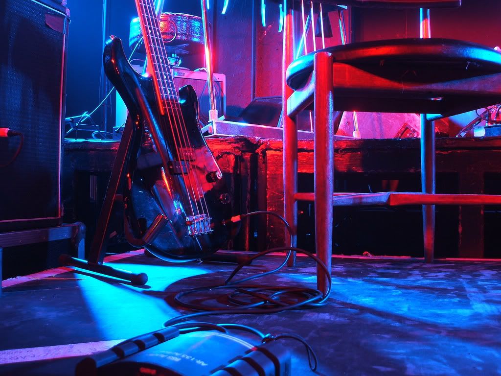
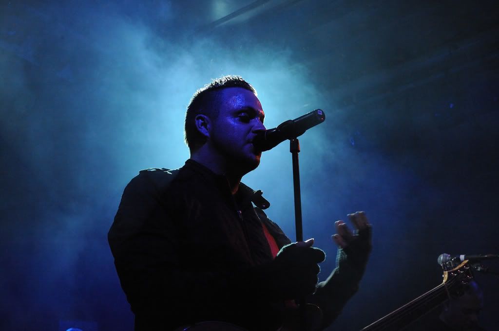
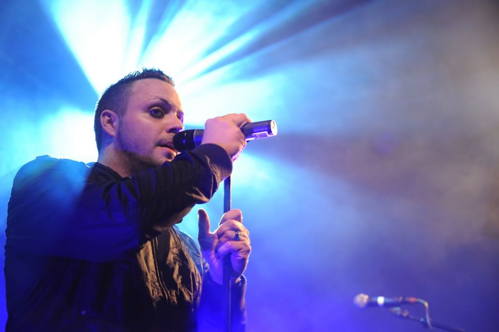
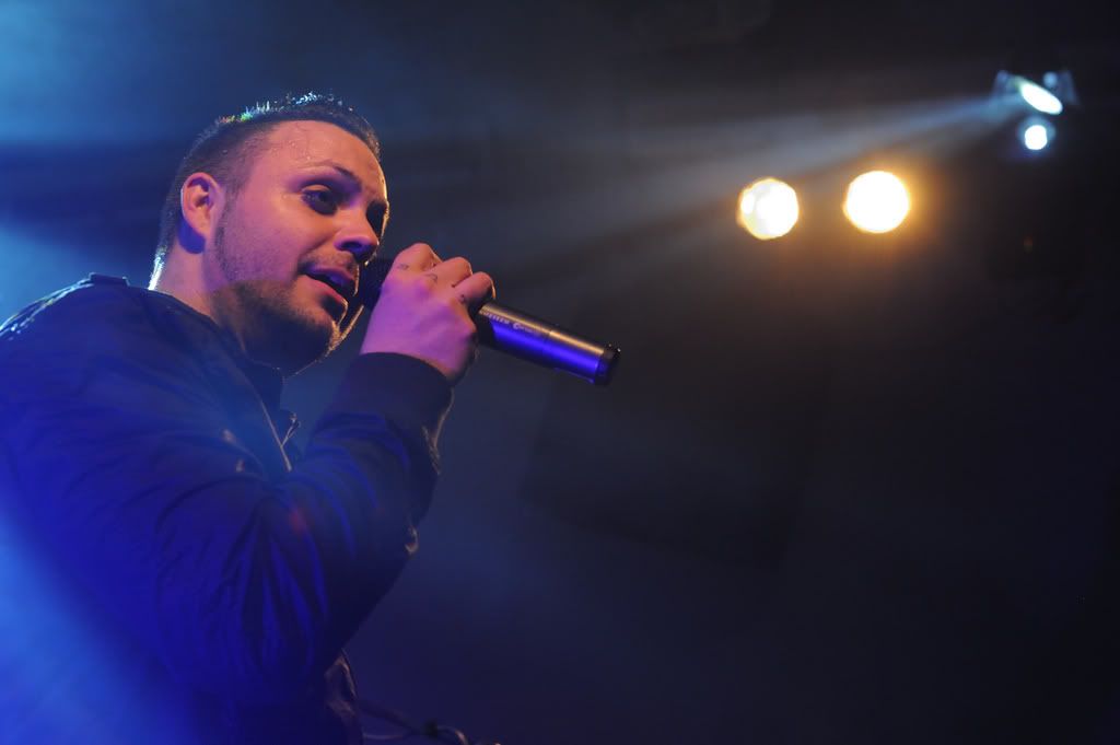
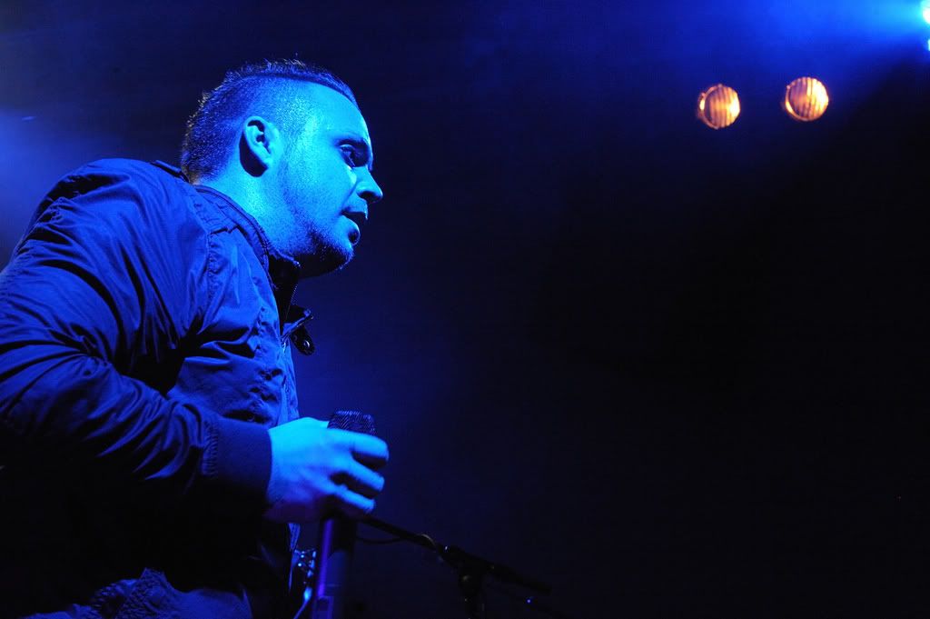
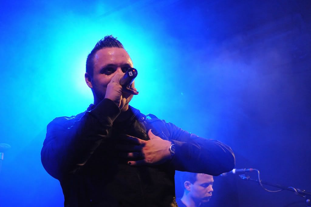
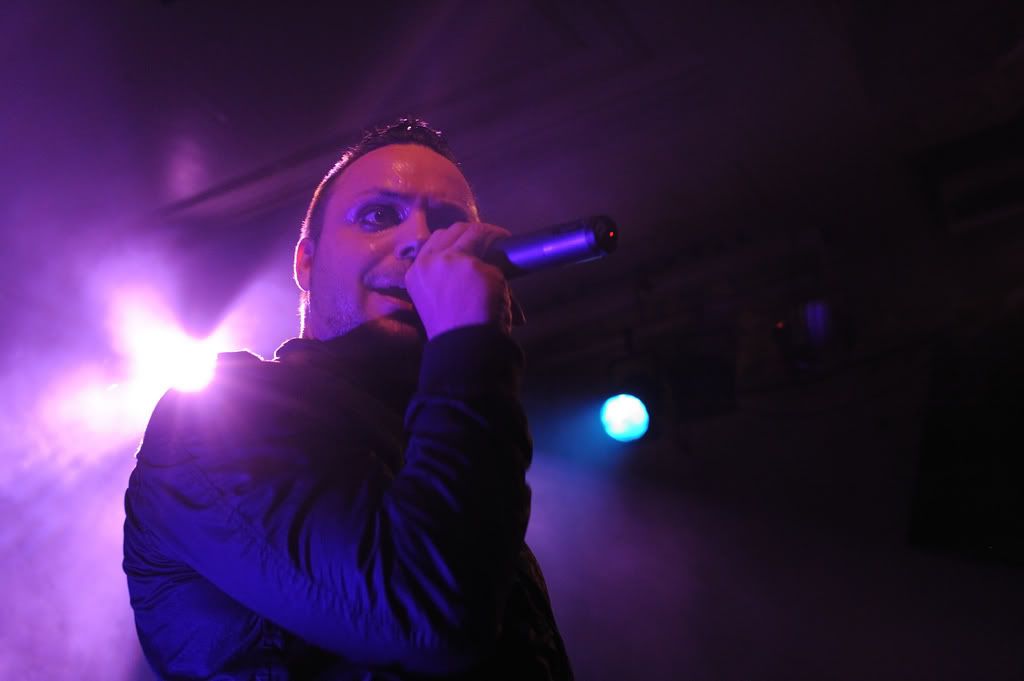
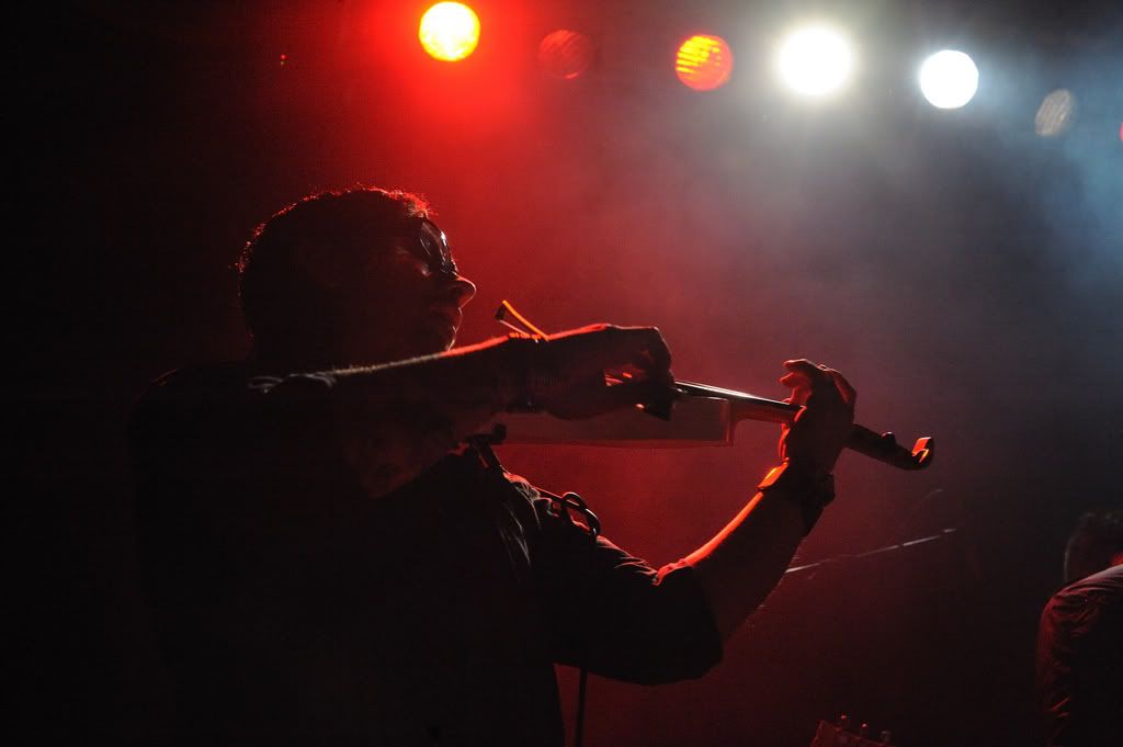
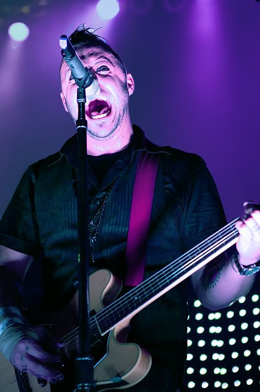
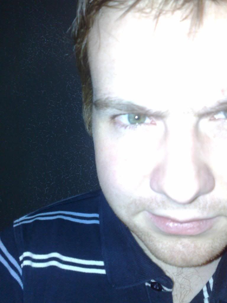
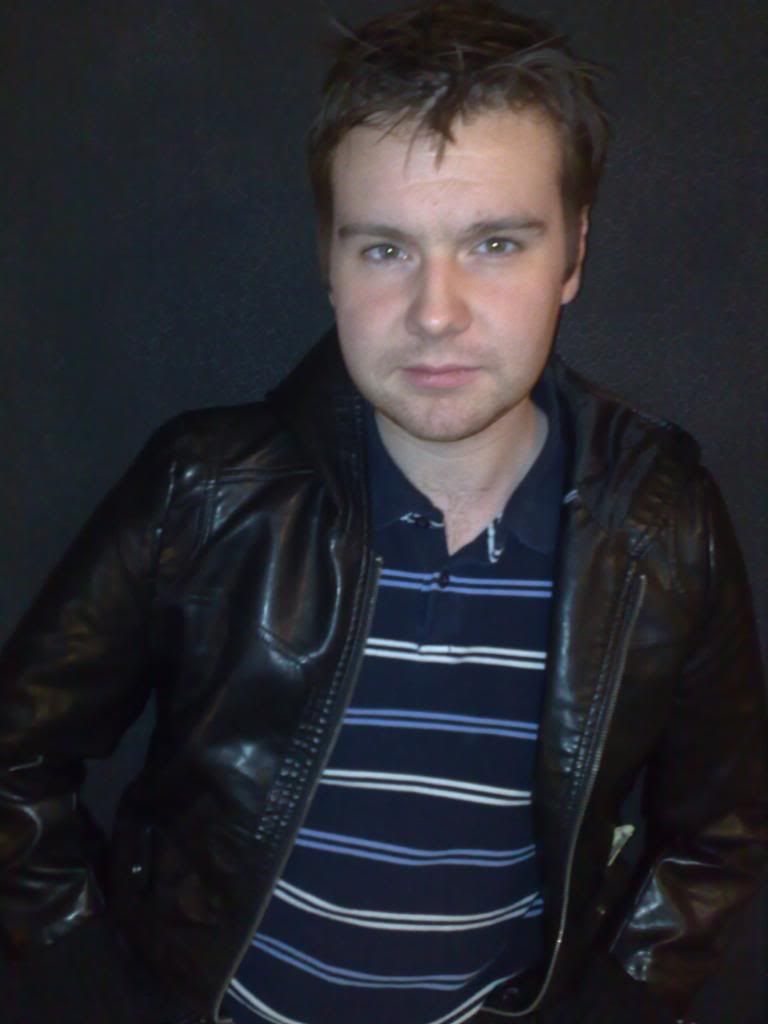
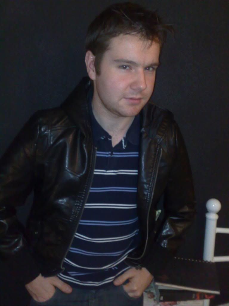
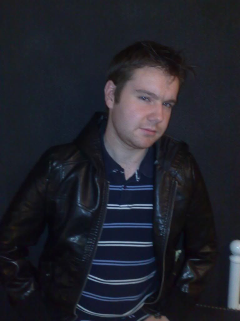
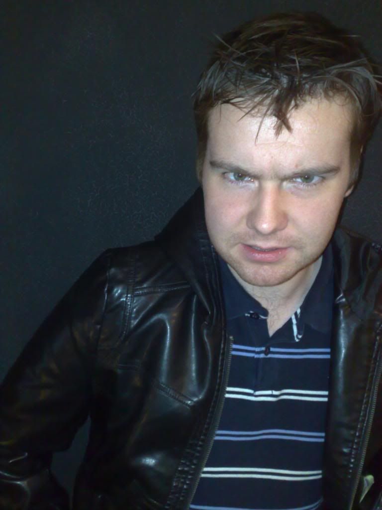
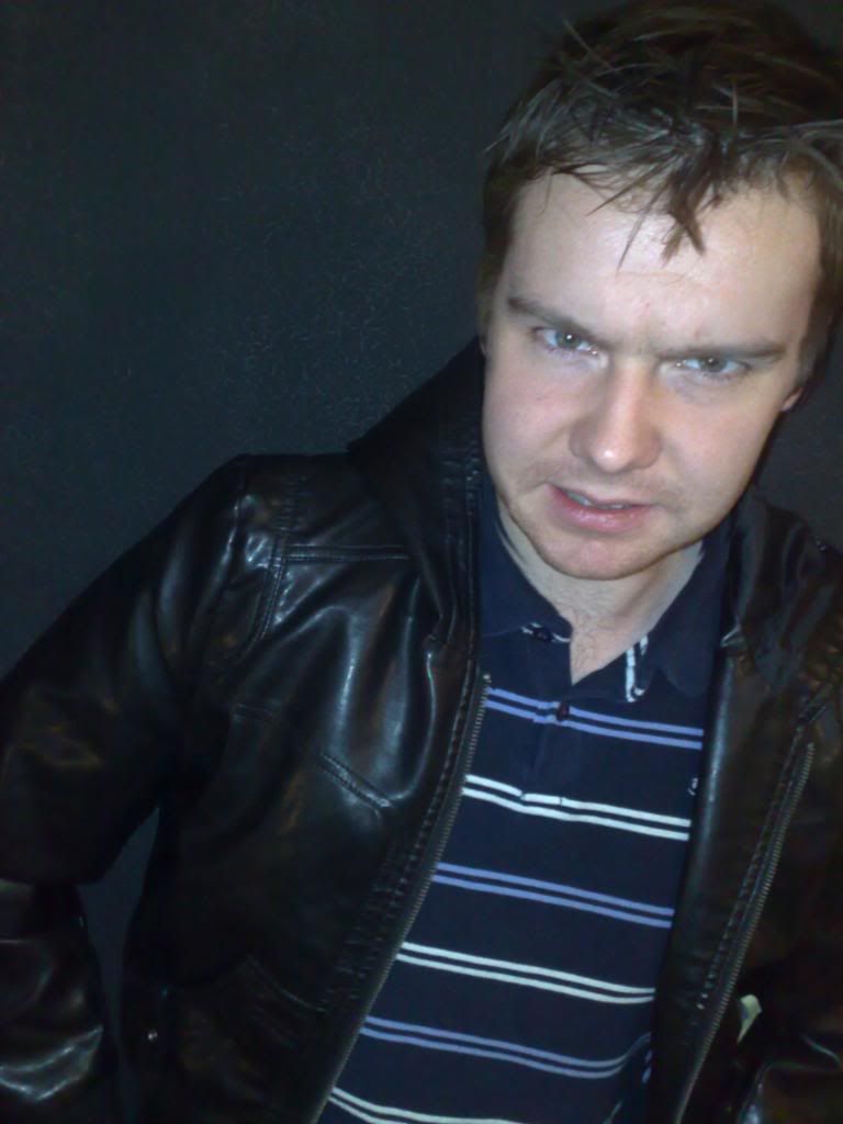
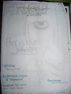
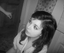
Work in progress.(screen grabs)
After I had finally chosen on the cover image i then pieced it together.
My final decisions for my magazine;
After I had finally chosen on the cover image i then pieced it together.
My final decisions for my magazine;
Price: £3
Frequency: Monthly
Issue Size: around 90
Positioning statement: All aspects of ROCK!
Distribution: Music stores, supermarkets, newsagents,
Rationale: The magazine I will be creating will include regular reviews, competitions, and bands/artists that aren’t very popular, or don’t appear in most magazines. I will offer the audience a choice of subgenres that don’t normally appear in other music magazines. This will broaden the range in where the magazine is sold, and who buys it- being the target to be any gender of the ages from 16-25
Style: : The magazine will be informal and will use simple sentences. The font and style of it will influence of the conventional genre of rock, and images and design will be stereotypical to colours of rock magazines already out on the market.
Regular Content
Monthly reviews from gigs, or interviews
Competitions
Poster specials
Album of the month
Lyric of the month
Gig/ concert listings
Feature Content
GRIZZLY BEAR
What it’s like being on the New Moon soundtrack
WHITE LIES
Just a little white lie
MUSE
Matt Bellamey talks to you
HINDER
The bands success story
LINKIN PARK
LOSTPROPHETS
SHINEDOWN
On the street’s of London
SLIPKNOT’S IN KNOTS
RELIENT K
Forget and not slow down
BREAKING BENJAMIN
KINGS OF LEON
Truth behind the cover art
YOUNG GUNS
Get a taste for technology.
NEW FOUND TALENT
BULLET FOR MY
VALENTINE
Are you ready?
ALL AMERICAN REJECTS
V. YELLOWCARD
PARAMORE
Talk about their new album
PRECISION
Their first concert revealed with an exclusive interview from the lead singer Darren
RADIOHEAD
30 SECONDS TO MARS
All you need to know
LIFEHOUSE
Becoming known
BLUE OCTOBER’S
APPROUCHING NORMAL
TOUR
House Style
Coverlines: BOOK ANTIQUA
Headlines: CALIBRI
Standfirst: Centaur 14pt
Captions: Centaur pt
Features first paragraph: Drop capital in CALIBRI 9 lines deep and first line in capitals
News first paragraph: first letter bold, first line in CAPITALS
Body text: Times New Roman 11pt
Colour scheme: Black, white, blue
Front cover image
Male/female early 20’s
Dark smart clothing
Heavy black makeupStyled hair
Medium close up
Eye contact without smile. Reflecting attitude and style.
Coverlines
WIN an all inclusive trip to L.A to see Greenday.
Yellowcard v. All American rejects. YOU DECIDE!
White Lies’ –‘Just a little white lie’
Lifehouse- their crack of fameExclusive! Poster special.


