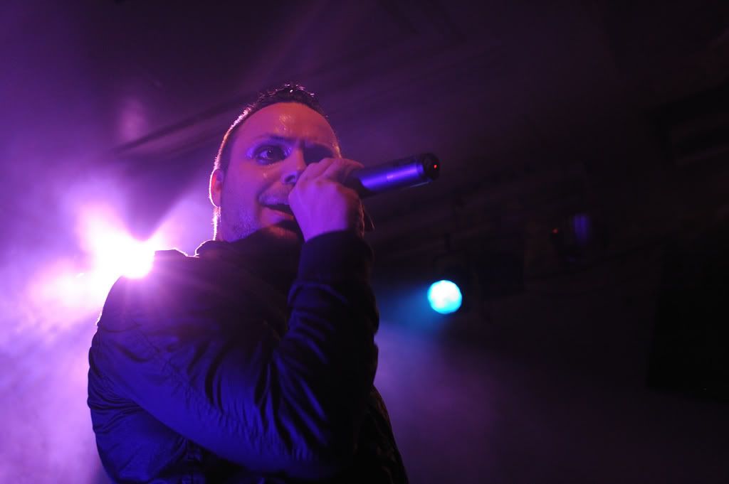
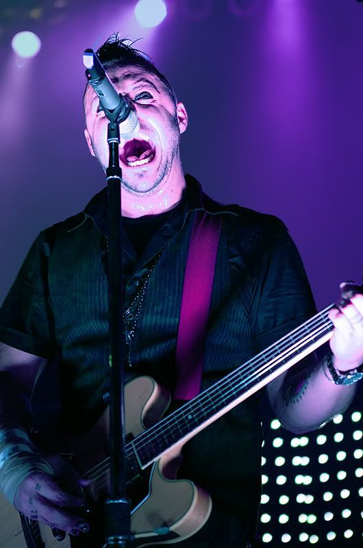
Codes and conventions of a music magazine cover.
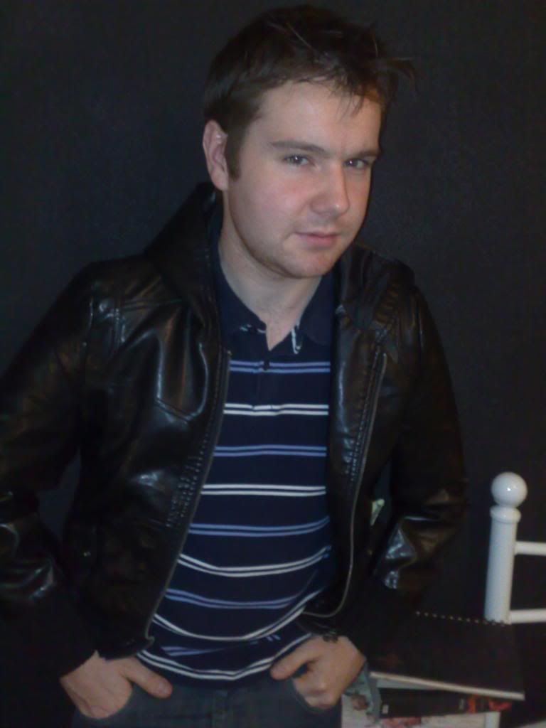
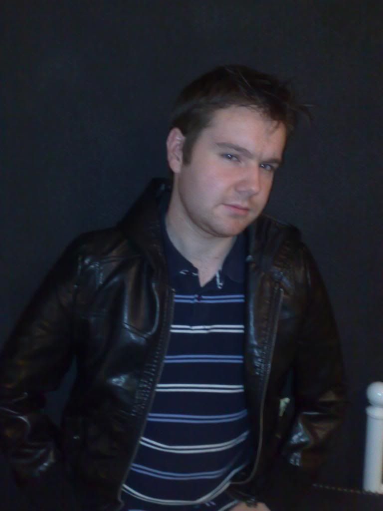
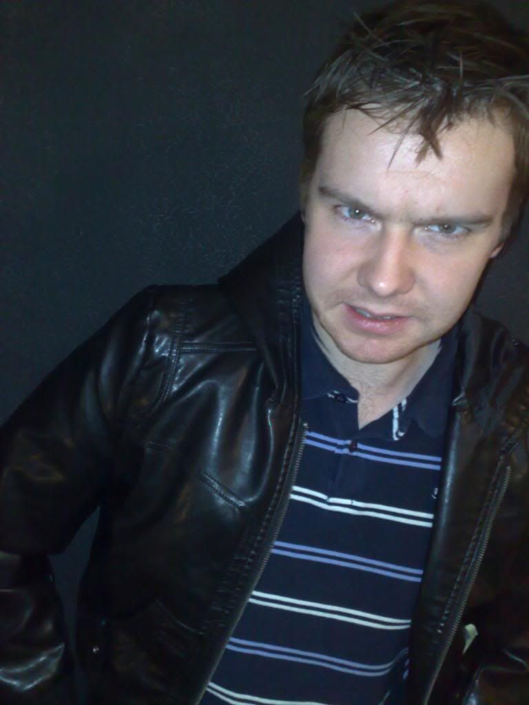
- There is one main image, usually of a medium close-up of a band/artist.
-not smiling and uses direct address, which conveys attitude
-main coverline- anchors the meaning of the main image, and is always the largest text, aside from the title
- Title is normally one word and in top left corner.
-uses a unique font
-largest text on cover
- Consistent colour scheme, with few colours
- Typography is undeviating throughout and few font used.
-the font connotations reflect the target audience and subject
-two types of font are:
-Serif T
-Sans serif T
- Coverlines are written with few words as possible
-main coverline
- two lines
-other coverlines
-two or three lines
- produce info about the content
-they frame the main image or are positioned to the left
-intrique the audience
- Positioning statement is by the title
- Masthead
-Issue date, Price, Title, positioning statement
- Strip/banner above title, or at the very bottom.
-includes lists of band/artist names and/or topics
- Buzz words draws in attention
-e.g Exclusive, free.
- Puff's- includes something extra in the magazine.
-e.g free poster
- Barcode- so it doesn't overlap the advert on the back page.
Codes and conventions of a music magazine contents page
- Letter from the editor
- Word 'contents' displayed at the top of page
- One large main image, plus smaller images
-page numbers on images to anchor them to written contents
- Same font and colour scheme as the cover
- Uses headings to divide and section out contents
-collumns (2/3)
pg.no TEXT
one or two words
sublines usually in smaller font
- Regular and Featured content
- White background
- Date
- Contact details
- Title of the magazine at the bottom of the page
Codes and conventions of a double page spread.
- Introduction
-Standfirst is always by heading which also tells you about it.
- Quotes are used on the main image to anchor to text.
- One large main image.
-takes up whole page
-usually bleeds across both pages
- Creative use of photography
-photograpger is credited
- More than one image.
-small images are used to break up the layout making it more inviting
- Strap line is often used to bleed
- Artists name is highlighted
- Headline should be abstract, creative and eyecatching.
- Inofrmal style of writing.
-personality comes through with personal opinions.
Byline is positioned by the standfirst
- Page number, title and issie date used.
- website listed
- use of limited colour
- split into collums.
Magazine Research
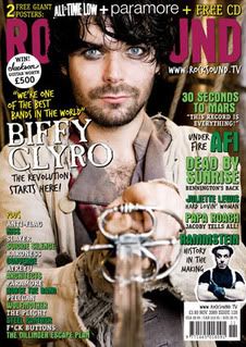
Genre; ROCK
Target Audience; Male+Female 16-25
ROCKSOUND magazine
Price: £3.60
Frequency: Monthly
Issue size: 130 pages
Regular content: RSVP/ The Noise/ Exposure/ Reveiws/ Lives
Feature Content: Biffy Clyro/ 30 Seconds to mars/ AFI/ Papa Roach
KERRANG! magazine
Price: £2.20
Frequency: Monthly
Issue Size: 72
Regular Content:Gig guide/ Feedback/ News/ Reveiws/ Album reveiws/ Swag
Feature content: Bring me the horizon/ FACT/ Rammstein/ Architects/ Paramore/
Behemoth
From here I conducted a questionnaie to help with the choices i will be making to produce my magazine.
Questionnaire Analysis
I asked 20 people of my target audience various questions to help me with decisions of the design and contents of my magazine.
1. Who is your favourite band/artist?
30 seconds to mars
Muse (2)
All American Rejects
Youmeatsix
Britney Spears
Jonas Brothers
Greenday (2)
Lady Gaga
Taylor Swift
Kanye West
Kings Of Leon (2)
Story of the year
Cliff Richard
JLS
Enter Shikari
The Kooks
Pink
Because a lot of people have different opinions on different artists/bands, I will take the more popular ones and include them in my production, and maybe a few other rock bands that they said. Muse and Greenday are popular rock bands and including them will make the audience attracted to the magazine.
2. What colours attract you to a music magazine?

According to my results the most popular colours that attracted people to a magazine were black and red. The next most popular colours were blue and purple. Dark colours seem to be the better option to take, with the results, but also because most of them are stereotypical to a music magazine.
3. Name tree words you associate with ROCK music.
Gigs (8)
Drums (3)
Tattoos
Gibson
Dance (3)
Guitars (5)
Black (3)
Energy
Dark (2)
Metal
Leather (2)
Skinny jeans (2)
Nice hair
Eyeliner (2)
Rage
Loudness (2)
Moshers
I decided to include this question because it allows me to view people’s different take on things, but also I can get ideas from this for the title of the magazine, and/or interpret them. Most of the answers will allow me to include some of these with my cover image of the magazine and what they should look like, or the colours I should use. Moreover the word ‘RAGE’ would make an interesting title as it has connotations of loudness and a dark sense to it, which would reflect onto the drums and how energy is produced with rock music.
4. What is your favourite colour?
Just like question 2, Black and red seem to be the most popular colours, so I will defiantly use them as a colour scheme on my magazine. Also green, purple and blue seem to be popular so I may decide to use them as well.
5. If you do, how often do you buy a music magazine?
I found that most people bought magazines every month, rather than every week, so as a result, my magazines frequency will be monthly.
6. How much would you pay for a music magazine?

£2-£3 was what the majority of people said they would pay for a music magazine, although 8 people said they’d pay £3 or more. Based on this I am going to price my magazine at £3 so it is between both amount, and most music magazines are priced either higher, and a little lower than this, making my choice seem reasonable.
7. Which music magazines do you like to read?
My results tellme that NME and Kerrang are the most popular magazines read and that, although 2 people said they didn’t at all. From this I’ve decided that I will look at Kerrang and/or NME as my style models for producing my magazine.
8. What main features do you look for on a music magazine cover?
Free Posters (5)
Good/Intriguing artists (3)
New found talent (3)
Free downloads
Free gifts (3)
Gig guides (2)
Exclusive interviews (2)
Features of favourite bands/artists
All the most popular answers I will include as main features or regular content in my contents. Also free posters is what people like about a music magazine, so including both will make my cover more effective.
9. Does a solo artist or a group make a cover more effective?
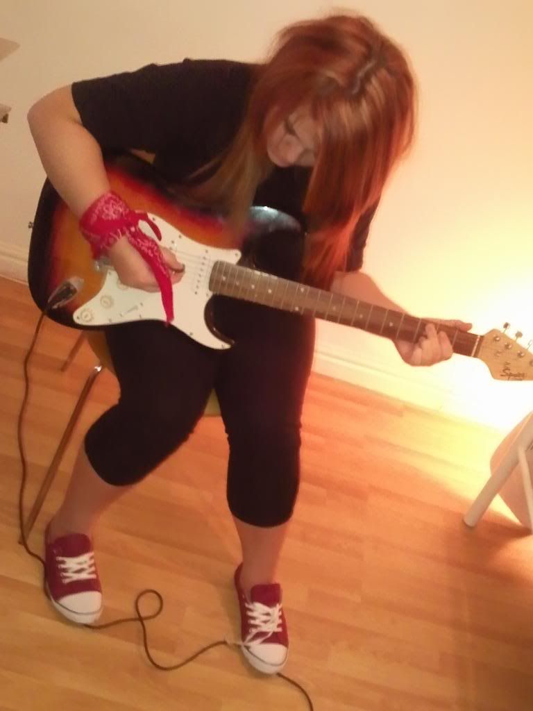
I asked them this question so it gave me an idea of what cover image I would have. It seems that most people say groups are more effective on a cover than solo. Although some of this may have been biased because the majority of people I asked were female. So I may decide to use a solo artist for my cover- due to 5 people not minding wether a group or solo artist.
10. What do you dislike about music magazines?
Adverts (12)
Lack of articles
Unnecessary information
They don’t include unpopular bands/artists with great talent (2)
Only one genre (2)
Long Articles
Too many bad reports on artists/bands
From this I noticed that a lot of people said they hated adverts, that they don’t include artists/bands that are well known and that there is only one genre. So from this I have decided to include many sub genres within my magazine, so that the audience has a broader range, unlike some magazines that only have one genre. Also I will include bands that aren’t very popular, or don’t appear in most magazines-because according to the question what they did like what new found talent, and exclusive interviews.
11. What do you like about music magazines?
Free stuff [posters, merchandise] (7)
Favourite bands on the cover (6)
Stories about new bands/artists
Interviews
Upcoming concert/gig details (5)
Gossip
Good pictures
Free stuff seems to be what attracts people to a magazine so I will defiantly include them on my cover + contents pages. A lot of people also said that they liked upcoming concert/ gig details, so I will include this on my regular features, but will also include an interviews section as they said they liked this too.
12. Are you male or female?
The majority of the people I asked were females so the usual outcome would be biased, although looking at my result the fact there are more hasn’t affected the results, in fact they seem to be similar. Moreover, as I analyse the results more males than females read the type of magazine I am going to produce.
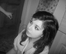
Here, an audience member has recorded some answers.