These are my rough sketch ideas for a new school magazine.
Cover+Contents.


Feature articles;
- Book of the month
- YALA
- Teacher's V Student
- Tie it in
- GCSE/ ALEVEL Results
- Science explosions
- Trick 'r' Treat
- Creative writing
- Drawing competition
- TRIPS
- Welcome note
- Quiz's
- Problems
- Sixth form area
PRODUCTION
Photographs taken for cover+contents


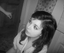
I used this as the background image ^


I used the above image because i decided to go for a halloween theme, and could incorporate a coverline. ^


This is my finished cover.

This is my finished contents page.

EVALUATION
For this task I was asked to create a cover and contents page of a new school magazine. My front cover follows the codes and conventions of a magazine, because the title is only one word long and is spread across the top; also it is the largest font on the cover. It has sub-lines showing the audience what else is in the magazine, and more information about the coverline. I added a banner along the bottom to add more information. In the top right-hand corner there is a bar code and a price, and i also added the issue number and date that the magazine was released.
Moreover, I have one main image on my cover-a medium close up, which is an anchorage to the main cover line. I chose to do a Halloween themed edition as it’s getting close to the holiday, and feel that people would be more interested to read it than any normal edition. I used the book 'Twilight' because it's very well known, and most students love it and would appeal greatly to them. In addition i feel that 'model' i sed did i good job at conveying a smile, but showing fangs, to address the theme. The cover line is the biggest text on my front cover excluding the title; using a chiller font because it goes with the genre of the magazine. The other cover lines on the front cover are left aligned so that the main image isn’t bombarded by other words, to distract the central focus of the image. The typography used throughout the magazine is a consistent serif (perpetua) and ‘chiller’ font. I used a simple colour theme of red, black and white, due to the genre again-Halloween.
I used Photoshop to produce my front cover, and didn't struggle on anything as I am a confident user. I mutated my font to make it original my using drop shadows and adjusted the size of the shadow and outer glow-also to stand out, almost like its jumping out at you.
I used Quark Xpress, to produce my contents page, I feel I could have done a much better job on the contents if I had more experience on the new package, but never using it before made my work lack in detail and quality. However, this also follows the codes and conventions of a contents page because, the main image on the cover is not featured inside although one of the other cover articles is displayed here. I carried on the theme of the ‘Twilight’ book by including a drawing completion; using one of my own for an example. The pictures all have a caption which tells the reader what the picture relates to- or if not, the picture is right next to the line it anchors. on the contents page, I have three headings which divide up my contents page “regular”, “feature” and a ‘Welcome back’ section. I also have “contents” in the consistent font I used on the cover, on a white background. I have one main image, of a piano and a girl with a guitar, and text to anchor the image to the article.